Memorable dining, modern branding, medium-end sushi bar.
An assessment piece was created for 'Visual Communication Design' at the Queensland University of Technology.

Project
DVB101 |
Visual Communication Design
Visual Communication Design
Year
2022
Tools
Adobe InDesign
Adobe Illustrator
Adobe Photoshop
Additional Links
N/A
Overview
Furō is the romanized pronunciation and translation of the word flow in Japanese. It is a sashimi bar that is nestled fittingly on Brisbane’s riverside serving a modern take on Japanese cuisine. It intends to encompass all of what makes Japan’s cuisine so inviting and fulfilling, emphasizing on locally sourced ingredients and especially fresh seafood.
Research
Contextual & Stylistic Inspiration
There is already an abundance of fast and franchised sushi eateries scattered around Brisbane and it eats away at the image of quality sushi. The goal of Furō is to maintain a modern yet casual environment that lends itself to a more approachable, yet intimate experience, something that is not attached to propriety but is run by those who are passionate about their craft and their desire to share their culture through food. The aesthetics of the branding is primarily inspired by modern typography and drew upon traditional Japanese art and elements of calligraphy. The colors chosen were also inspired by their graphic design which plays a lot on large expanses of vibrant color that usually contrasts with white or cream to which I found simplistic palettes suited Furō greatly.
Moodboard

Personas
Michael & Taya
Taking into consideration the contextual research and the overall vision I had in mind for Furō, the branding aims to attract groups of white-collared workers who wish to catch lunch with colleagues or wind down with a drink on the weekend, alongside trend-hunting youth wanting to add another location to their repertoire of hangouts.

Designing
Ideating and Sketches
The design process involved plenty of tinkering and altering. Most of my initial sketches and brainstorming were incoherent messes on paper but I chose a select number of concepts to potentially refine and work on. This was done via a drafting grid which also held ideas of another name for the brand, this process allowed me to properly weigh my options and see which name was more flexible to work with. As a designer there are things that can be easily interpreted that others may not see, so during the sketching process, I made sure to ask those around me how they interpreted the brand and work off their opinions. When it finally came to illustrating the final design, I ended up deviating a fair bit from the original, but I believe the end results better conveyed what I envisioned.


Refining
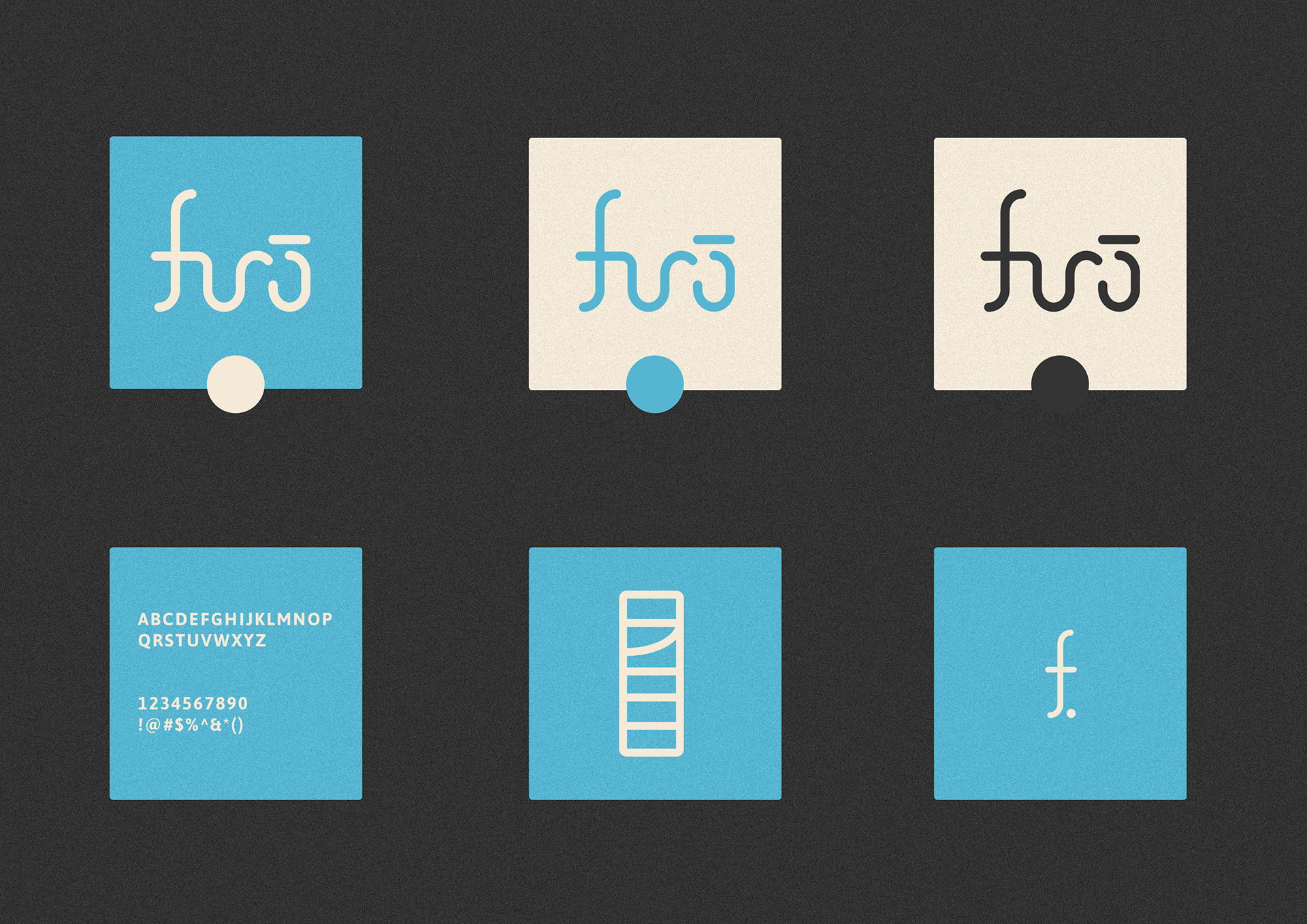
As a result, this is the finalized concept for Furō, alongside color variations and contextual mock-ups.
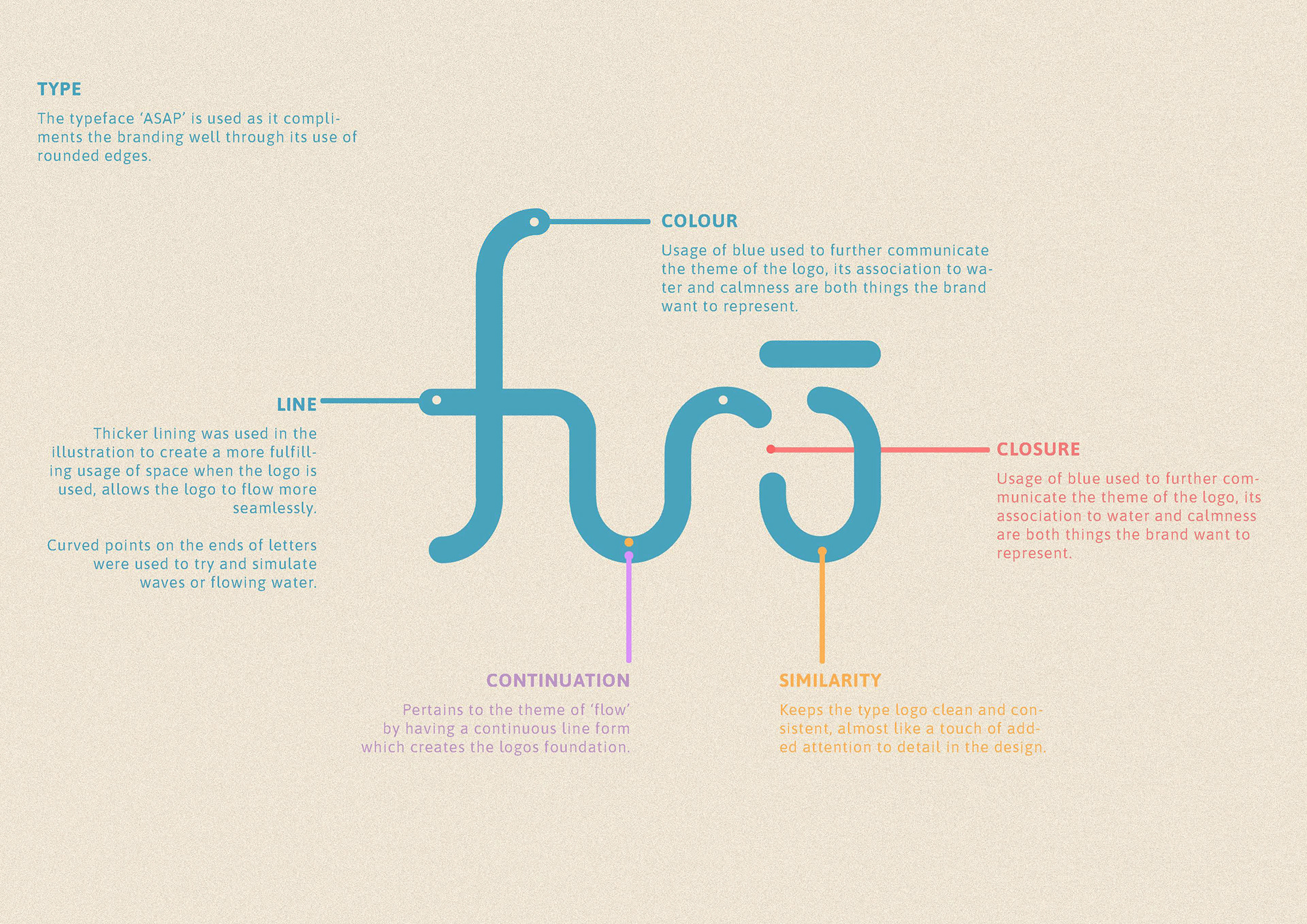
The Final Breakdown
The logo itself is a wordmark, a custom type logo which uses clean, line illustration to provide a modern twist, however instead of hard edges, use of rounded caps and thicker lines were used instead to soften the appearance allowing the connected sections of the logo to appear more seamless. This is paired with the typeface ‘Asap’ which compliments the style perfectly due to the rounded sans-serif style of the font.