Providing young adult renters energy-efficient homing.
Service proposal for Australian home consultant company, energyFit for the unit AMB251 at the Queensland University of Technology (QUT).
Project
AMB251 |
Designing Innovative Goods and Services
Designing Innovative Goods and Services
Year
2022
Team
N/A
Additional Links
Figma Prototype
Overview
energyFit is an Australian-based company with a focus on providing energy-efficient living for Australians through their digital solutions. The company is currently aware of the use of its service within the homeowner market but is simply unable to provide the same level of service as those in the rental scene due to its fixed nature.
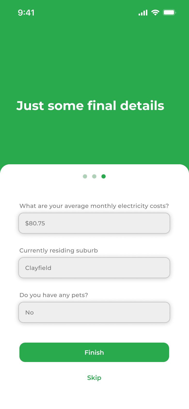
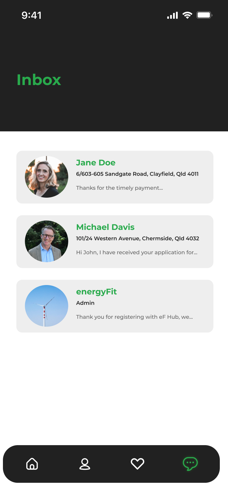
energyFit (eF) Hub intends on facilitating the connection between landlords and renters by providing them a platform to access energy-efficient properties.
Research
User Problem
The company has a deeply rooted homeowner client base but is failing to appeal to young-adult renters. This is due to rental property modifications reliant on landlord decisions, with many not wishing to utilize energyFit's service as a result of split incentives between tenant and owner. This has led to energyFit seeking out a product or service that can attract younger renters whilst engaging with their business.
Background Research
• Gen Z and Millenial have generally higher awareness when it comes to sustainability.
• Landlord-to-tenant interactions are skewed, especially when approaching upgrades and fixed appliance installations.
• Focus on apartment living for young adult renters in comparison to home purchases.
Persona, Empathy Map & Journey Map
Meet John
Based on the background research conducted for the company and its target demographic outlined in its problem statement, John is the persona that eF Hub will be based on. It was important to utilize both empathy and journey maps as they provide information that is vital to the expected flow of the application in its design stages.


Designing
General User Flow
A simple user flow was created to track the needed pages and components. This provided much-needed structure before the designing of any components and set the foundation for the rest of the design process.
Sketches
Simply based on the target demographic it was easier to facilitate interactions between the business and its clients through the use of a mobile app. Understanding relevant styles, and key user features on existing applications in both a general and real-estate scope were important to help distinguish details to focus on, especially when conveying property data.
Wireframes
It was now the time to start piecing everything together through a series of wireframes that explore the onboarding, sign-up process and general layout for the applications dashboard.
Style Tile
Prior to refining, adding visual styles to typography and visual elements was briefly laid out to ensure the final design appears cohesive and legible to the user.
Refinement
The rest of the styling was incorporated into the rest of the application, making sure to maintain consistency between the official styling on energyFit's existing website.


Reflection
The eF Hub application was definitely a step out of my comfort zone as the industry is something I have little to no sufficient knowledge of, making it difficult for me to naturally understand the business's values and its core functions for its clientele. Regardless, the application acted as a stepping stone into general UI design though I would have liked to have more opportunities to complete more user research and testing, especially in the latter design stages.

