

Helping mature users adapt to modern UI.

Project
DXB311 | Advanced Interaction Design Project
Year
2022
Team
N/A
Additional Links
Figma Prototype
Overview
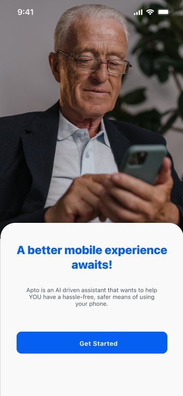
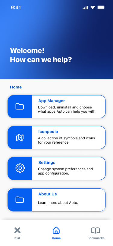
Apto is a mobile application that aims to increase confidence in mature to senior-aged users by providing them a platform to access popular apps and provide online enrichment through the use of smart guides.
Research
User Problem
As a capstone project we students were given the freedom to choose a topic of focus to base our project on. In my case, I opted for 'Ageing Accessibility' heavily inspired by my first-generation immigrant parents. Involved with the rapid shift into digital media and online experiences I know my parents aren’t the only ones who are struggling with this transition, which is where Apto steps in.
Background Research
• Desktop usage has declined in favor of smartphones and tablets
• Subjective and technological barriers are the main factors that affect the accessibility of devices
• Coordination skills with the mouse are among the most obvious difficulties observed in elderly interaction with GUI. • Studies conducted on website UI have found that older users have a more centralized focus.
Background Survey
Conducted with the parents of my peers a survey was done to determine the general tech competency amongst older adults and the difficulties they face.


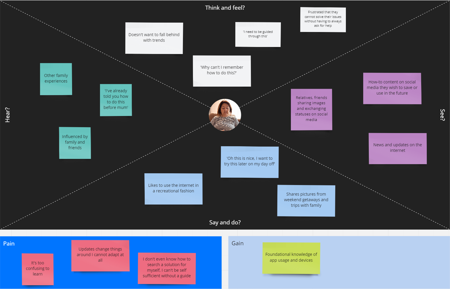
Empathy Map
Meet Nora

Designing
User Flow Map
Prior to prototyping, the use of a basic wireframe was done to understand the interactions needed and the flow between different parts/elements of the application. Due to the nature of the application, it was important to set the foundation of the overlay interactions as this would act as the main feature of Apto.

Concept Sketching
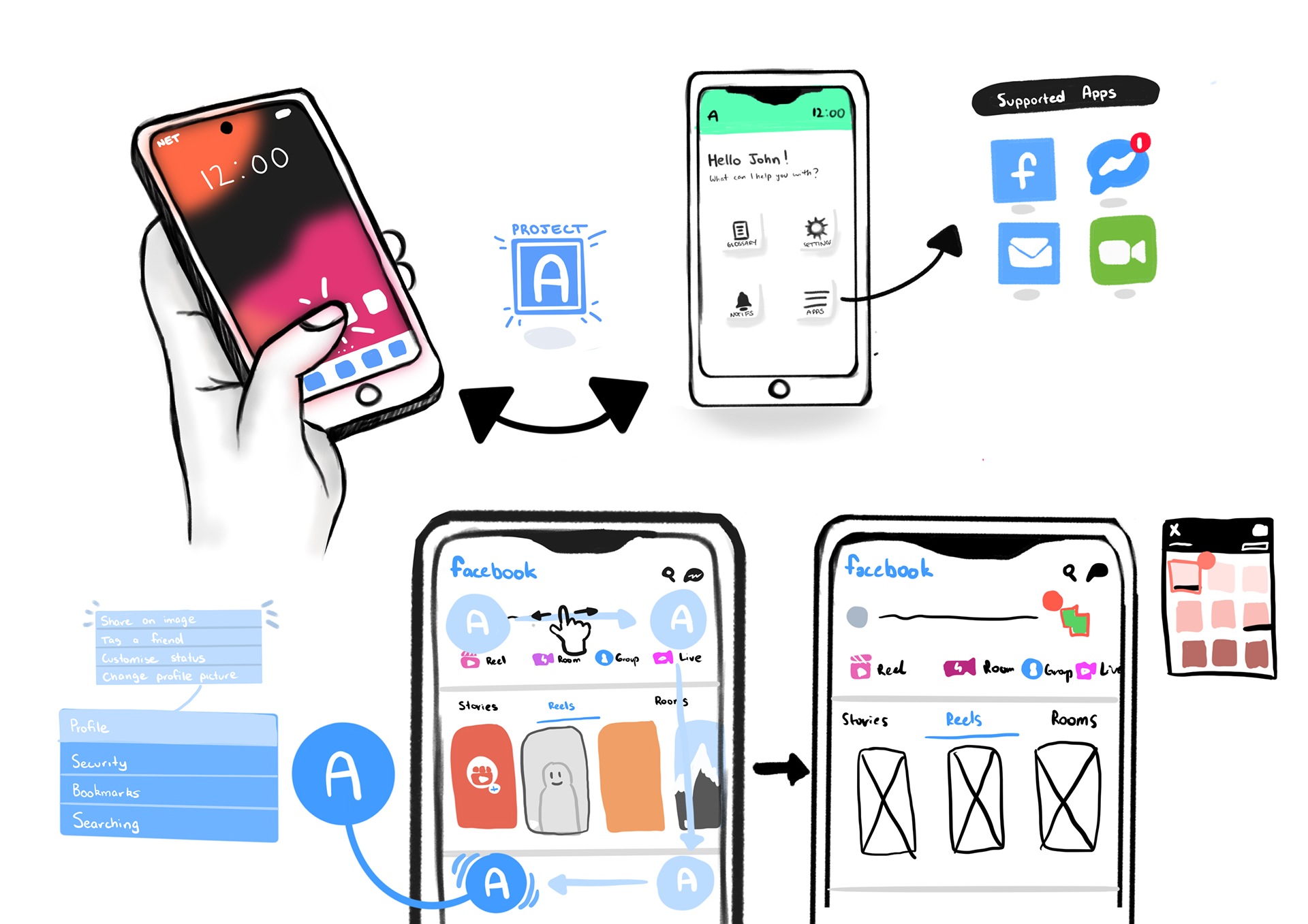
As part of the capstone, we were required to present a brief overview of the application. The below illustration was used in my presentation as a basis on Apto's usage ranging from the intended motion gestures to the mixed usage between the overlay elements and the application dashboard.
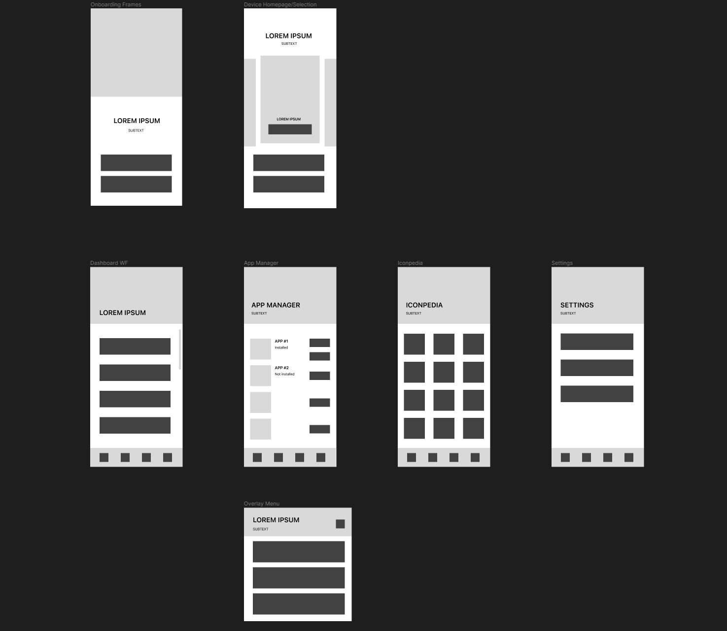
Wireframes
My main challenges lay in the wireframing process and further into the transition of these wireframes to the prototype phase. A part of me wished to include a sufficient amount of sections in the main app itself to promote user return, encouraging habits with learning or memory retention due to the older demographic. As a result the wireframes tried to reflect a very primitive, basic style to avoid overcomplicating or adding of unnecessary details so early.
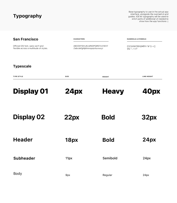
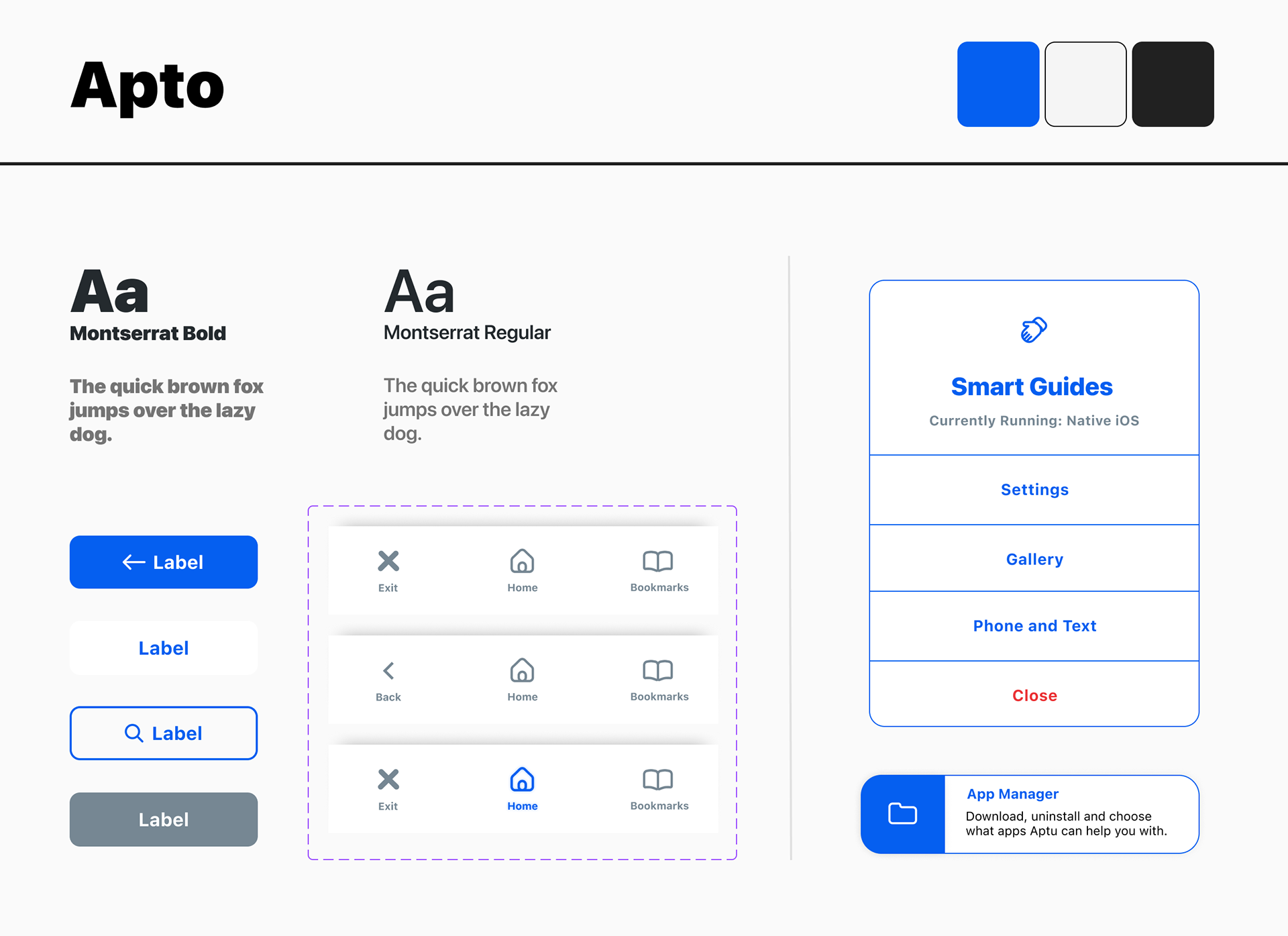
Style Guides
Taking into consideration user research prior to the design phase and surveys, the usage of high contrast and boldened text was put into mind. The idea was to have minimalistic, yet usage of saturated colours to bring attention to specific pages and features. The concept of Apto was intended for iOS devices in consideration of the more user-friendly nature that sets the foundation for the app to build on, hence the use of San Francisco - the native iOS font - creates a consistent theme that keeps the user immersed with the intention to maintain immersion within their task.

Refinement
These styles were eventually incorporated into the final prototype. However, along the line, there were issues with contrast or visibility which were gradually altered over the course of the final prototyping phases. I had to make more conscious decisions regarding aesthetics, having to balance the functionality with that of a demographic that is very different from my own.


A/B Testing
The overlay was a major pain point to consider when refining its user flow. Nearing the end of the project I conducted a single A/B test with the time remaining, with a group consisting of the survey participants from the defining stages.
The A/B test consisted of two separate Figma flows, one with the originally designed UI for the overlay menu and another that was further simplified. In addition, the first flow used a mix of blurring and outlines to assist the user in completing an interaction - in this case, sending an image on Messenger - whilst the second utilized a coloured overlay for improved visibility. The first flow would essentially loop the user back into the initial start point where it would then loop once more into the alternative UI.
The participant would then complete a brief survey on their preferences and their experience with the testing.

Reflection
Taking into consideration that this was one of the largest projects I undertook as a part of my capstone there was a lot that I learned. As this project was heavily focused on a demographic that I am quite out of touch with, it was easy to get lost in making autonomous decisions. I am thankful to have my parents supporting me with the creation of the project, considering their heavy influence on the topic I chose to begin with. I was able to gain further insights into myself as a designer alongside the developed beliefs and approaches to consider in the future.
This project was a major test at Figma considering the hybrid nature of Apto itself was hard to design around as the version of Figma I still had technical limitations that could not cater fully to the end product. Rather it was an experience to design the elements, a more personalized onboarding system, and to envision technologies like AI and machine learning to be used in the new wave of design.